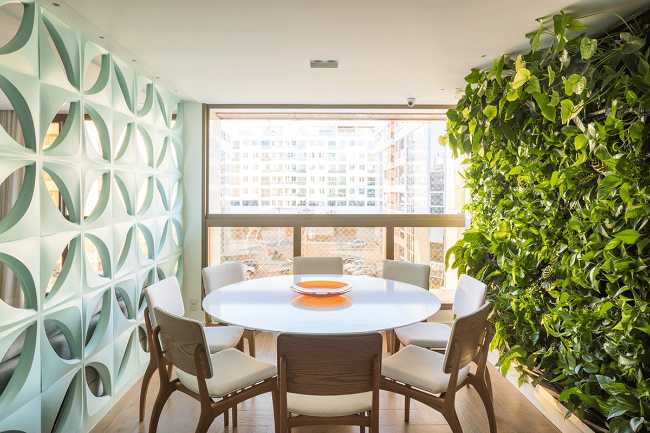
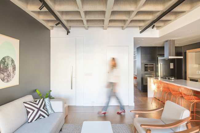
The renovation of this apartment seeks to update the system and improve the entrance natural light. The original layout of the building's units suffered from a very poor arrangement of space: a closed and dark kitchen as well as poor ventilation due to the "L" shape
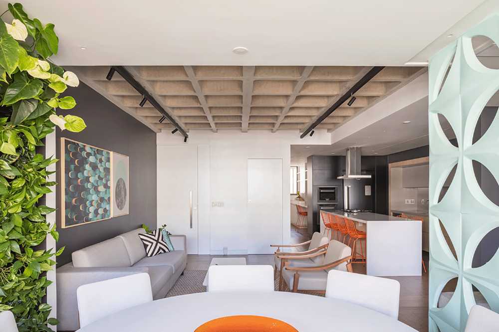

Traditional Brazilian plan is refurbished. The apartment becomes spacious and bright
The renovation of an apartment in a neighbourhood of Brasilia by CoDA arquitetos saw an update of a traditional plan, which limited the entry of natural light and created a poor arrangement of interior spaces
- #America
- #Brazil
- #Apartment
- #Restyling
- #Interior
- #Interior Design
- #Architectures
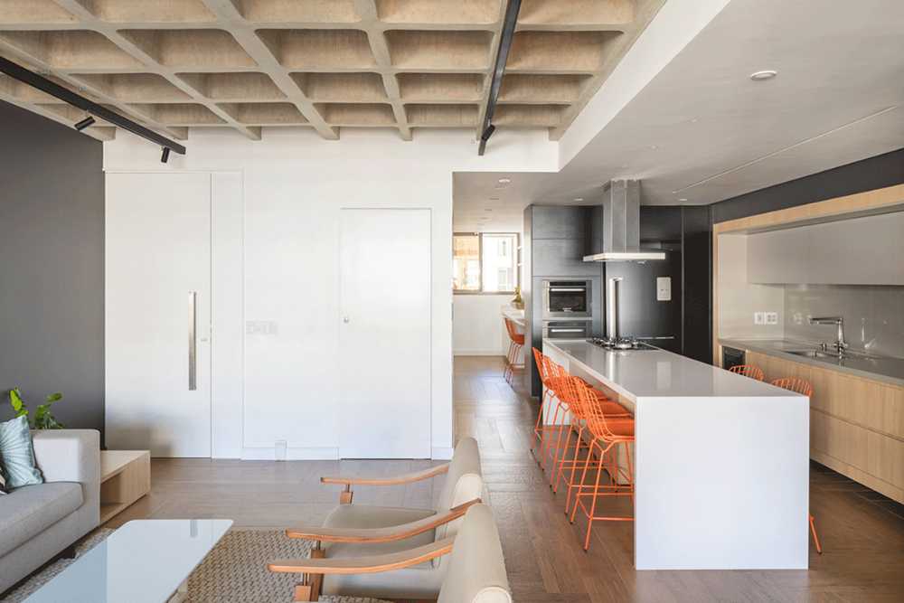
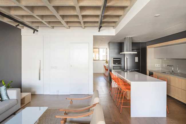
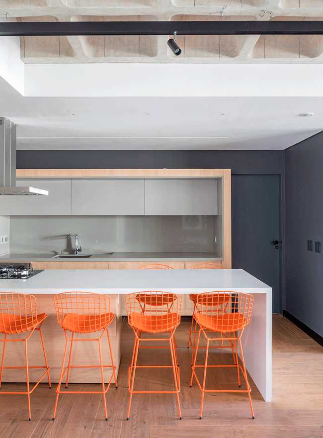
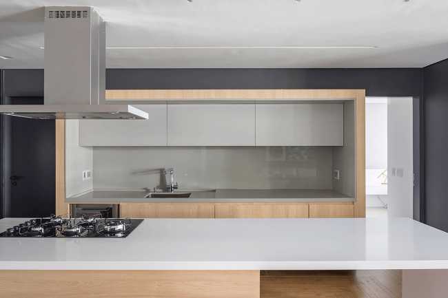
The clients' greatest desire was to live in a large, contemporary, barrier-free space. For this reason, the starting point was to open the kitchen onto the living room, creating a space that would play a central and social role within the home

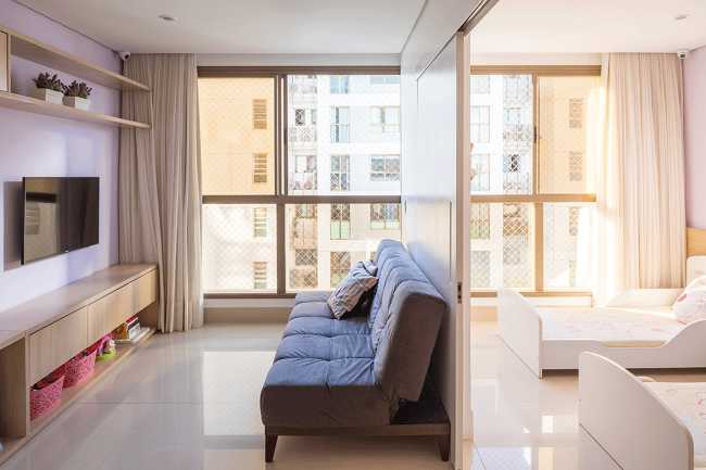
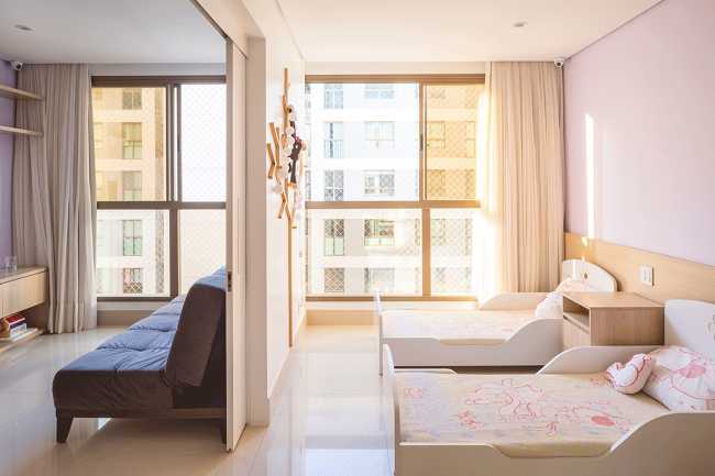
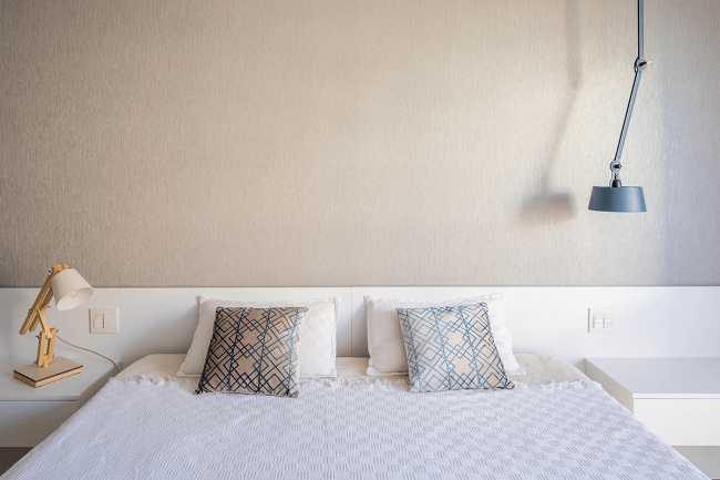
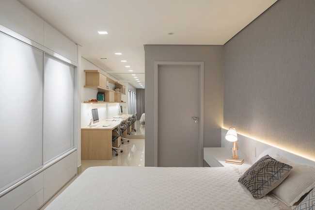
At this point, everything revolves around this space: the daughters' rooms, the double bedroom of the couple, opposite the living room, with the laundry room behind. The kitchen is thus treated like the main element of the house, no longer as an addition

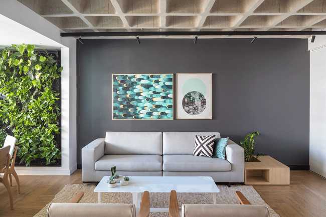
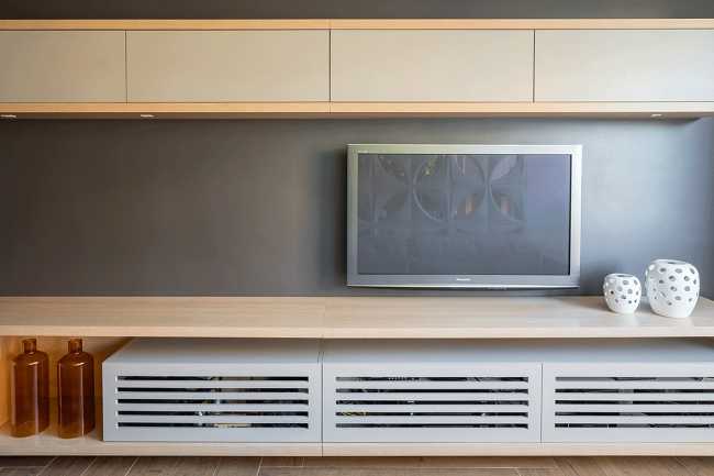
The main walls are dark and highlight the objects in front of them. The kitchen is characterized by the island and the frame. The other elements are arranged on the walls with a dark colour and are more discreetly present

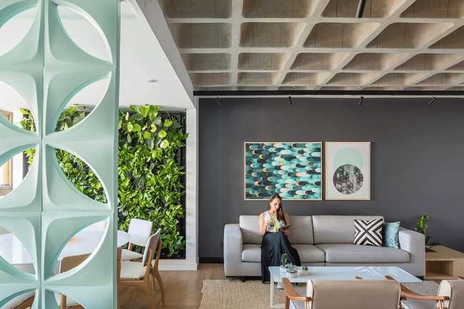
In the living room you can see the coexistence of different elements. The living room has a higher ceiling, thanks to the demolition of the plaster ceiling. The result of the project is an extremely bright, ventilated and spacious apartment, in which the various rooms can be enjoyed simultaneously
