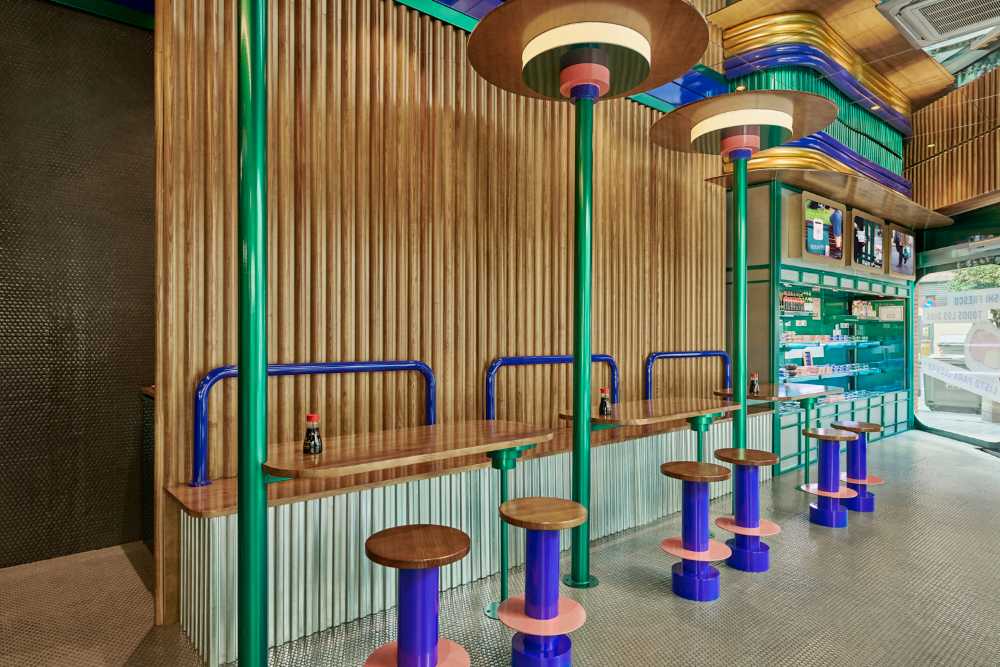
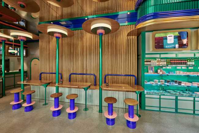
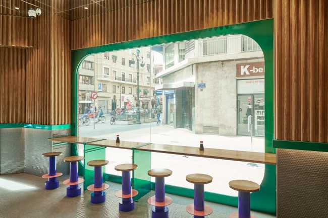
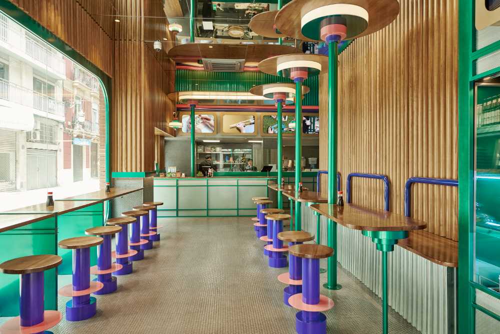
Thanks to this new project, the space has more capacity than in other shops, with a refrigerator plus a much larger kitchen. The thing that is highlighted most is the high ceiling and the fully glazed window. Starting from these points, the design comes from the usage of the existing architecture of the interiors

Take away and Design. In Valencia, a chain of restaurants focuses on design and colour
Masquespacio designs the third Kento Shop, the Valencia chain specializing in Japanese take-away food, with particular attention to sushi. This third location is the largest so far at 100 m2. Key points, the high ceiling and the large glass window
- #Spain
- #Furniture
- #Design
- #Restaurant
- #Interior
- #Restyling
- #Architectures
- #Interior Design
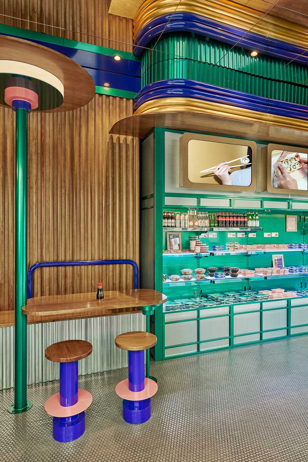
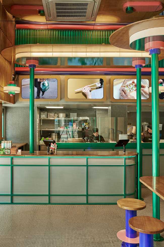
In this case a mirror was used to create an infinite perspective for the ceiling, while most of the tables were oriented towards the outside, to offer most diners a direct view of the street. The main materials used are grey mosaic tiles for the floors and some walls, which create an interesting contrast with the corporate colours of the brand used for the furniture and lighting

Adding semicircular strips of wood on the walls, which remind us of the "bamboo woods", not only highlights the Japanese aspect of the space, but also adds a touch of warmth to an interior with different industrial materials such as metal and ceramics. . The furniture and lighting itself, uses a limited amount of gold, which unlike other restaurants is replaced by the corporate colours purple and green
