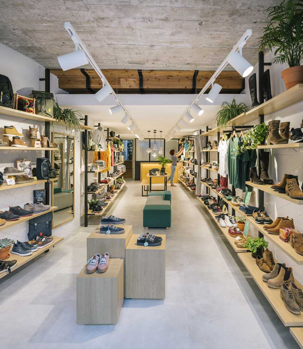
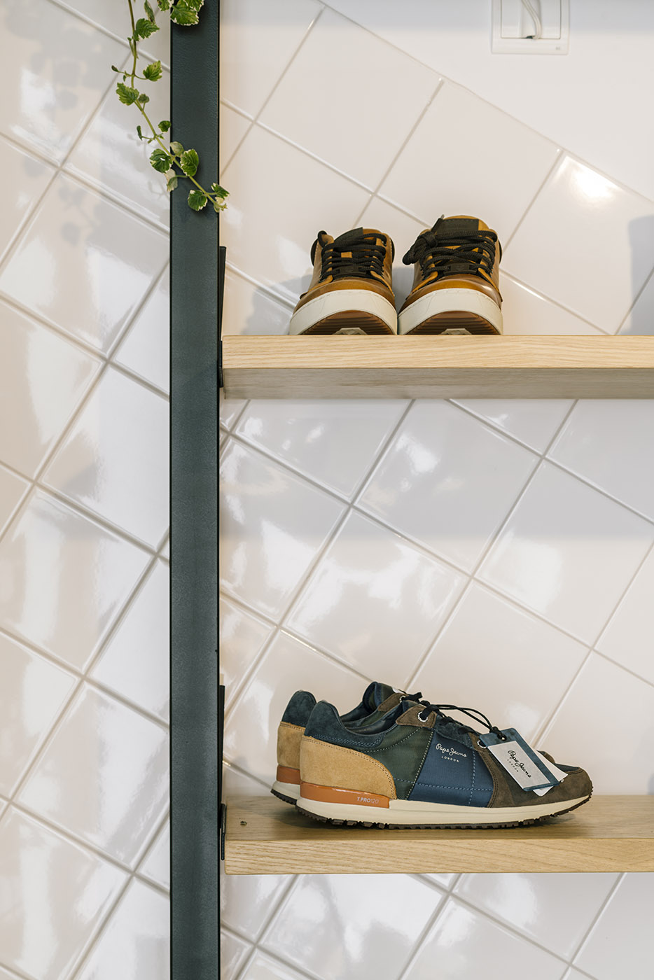
To highlight the product, Zooco Studio, opts to use a continuous gray floor and a white ceramic coating and plays with the various elements and geometries to make Loopo a more dynamic and attractive space


Loopo, a cool and young place. Yellow and neutral tones render the product a protagonist
Loopo was born with the aim of creating a different version of shoe store, trying to combine the renowned Spanish "zapatera" tradition with a more avant-garde design. It seeks an attractive and neutral space, where the product becomes the main protagonist.
- #Europe
- #Spain
- #Commercial
- #Shop
- #Ceramic
- #Color
- #Interior
- #Interior Design

On this base, vertical posts from floor to ceiling are arranged rhythmically on both sides of the space. These posts allow different elements to be placed between them and at different heights creating multiple combinations of displaying the product, making it the true protagonist of this space

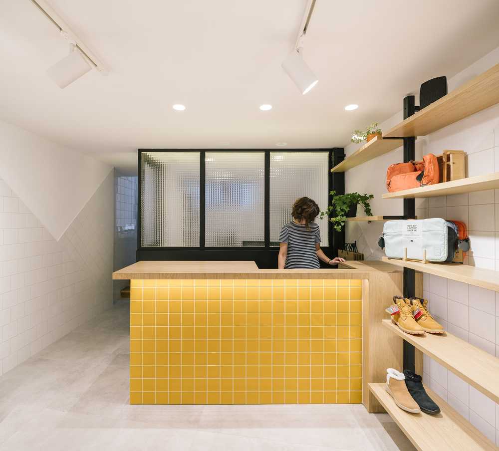
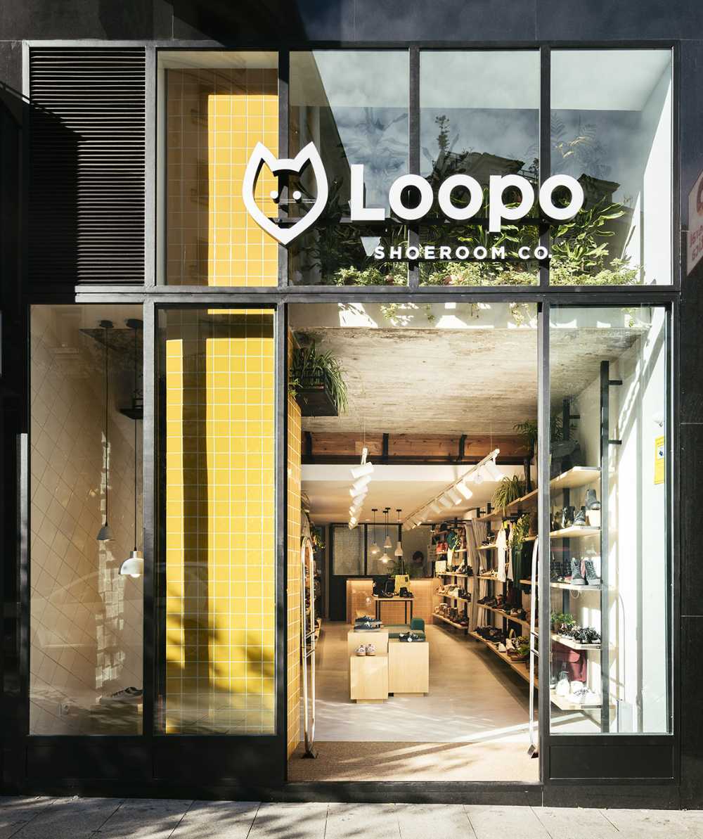
The counter appears as an element of continuity of these ceramic risers and of wood tiles. The touch of color is added through the mustard tone of the tiling. From the outside, the storefront highlights the double height of the space; filling the upper part of the space are flourishing plants. The feeling of height is reinforced by the pillar that picks up the mustard color of the counter

Gallery
Photo credits
Top image, content and gallery images: Imagen Subliminal


