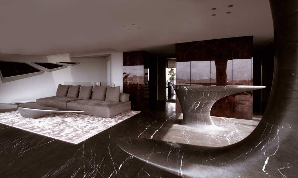
The greatest responsibility of architects is to create buildings that are in harmony with the surrounding environment, whether natural or not, and therefore must not encroach on beauty with hard shapes that perforate the landscape, whether urban, recognizing the intrinsic modernity of contemporary materials and forms. So when a building is built on the threshold between urbanization and the natural environment, it must blend in with the aesthetics surrounding it.

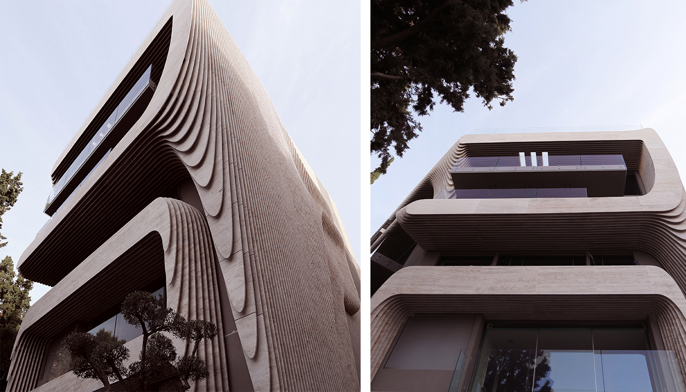
Building in Athens between urban and natural. The architecture respects the surrounding environment
One Kleomenous is designed by the Omniview Studio as a response to a new way of thinking about architecture, not only focused on functionality if not for its task: the building must harmonize with the aesthetics that surrounds it, merging urbanization and nature.
- #Europe
- #Greece
- #Architectures
- #Complex Residential
- #Architectures
- #Architecture
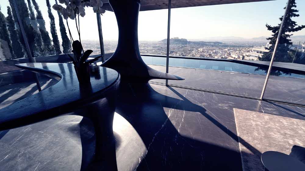
It must be as contemporary as a city building wants, but, above all, it must blend in harmoniously with the land and nature. This was the case with One Kleomenous. Investors and architects who shared the love for the beautiful hill of Licabetto, where the building stands and created an innovative typology. The aforementioned problem of hybrid aesthetics was pursued through two main trajectories: the language of design and the material choices.
The positioning, orientation and functions of the building have been carefully studied to develop the facade. At the end of the city there was a vertical building adjacent to it that pushed us to continue in this direction. The urban fabric further inspired the use of simple stucco, one of the most popular materials in the city. At the end of the forest, the volumes of the balconies were almost touched by the trees and plantations and were geometrically manipulated to assume the fluid forms of the hill.
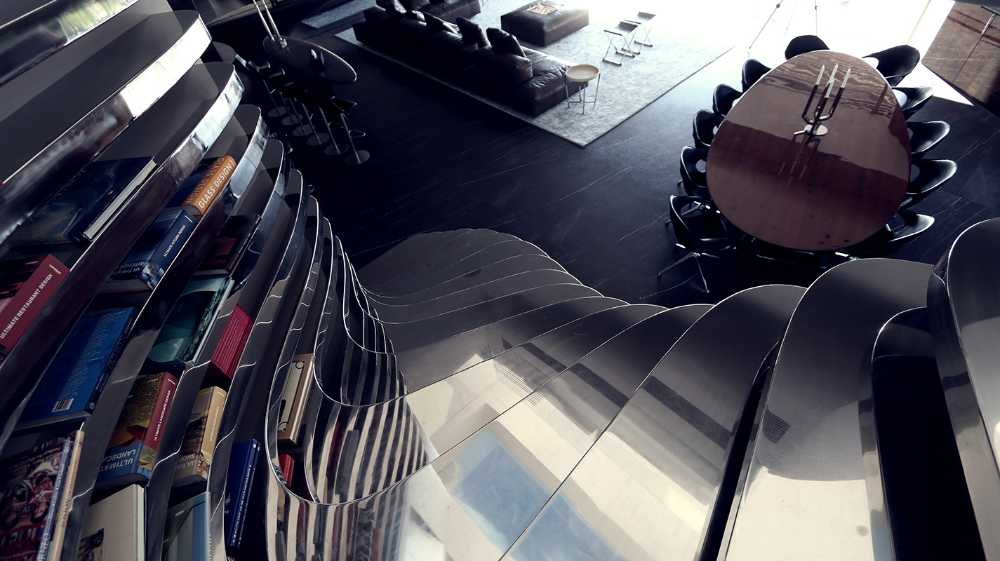
While looking for inspiration, an old topographic map of the hill attracted attention. A landscape is created on the facade, among the shapes of the balconies, with volumes that reflect the topography, divided into several sections
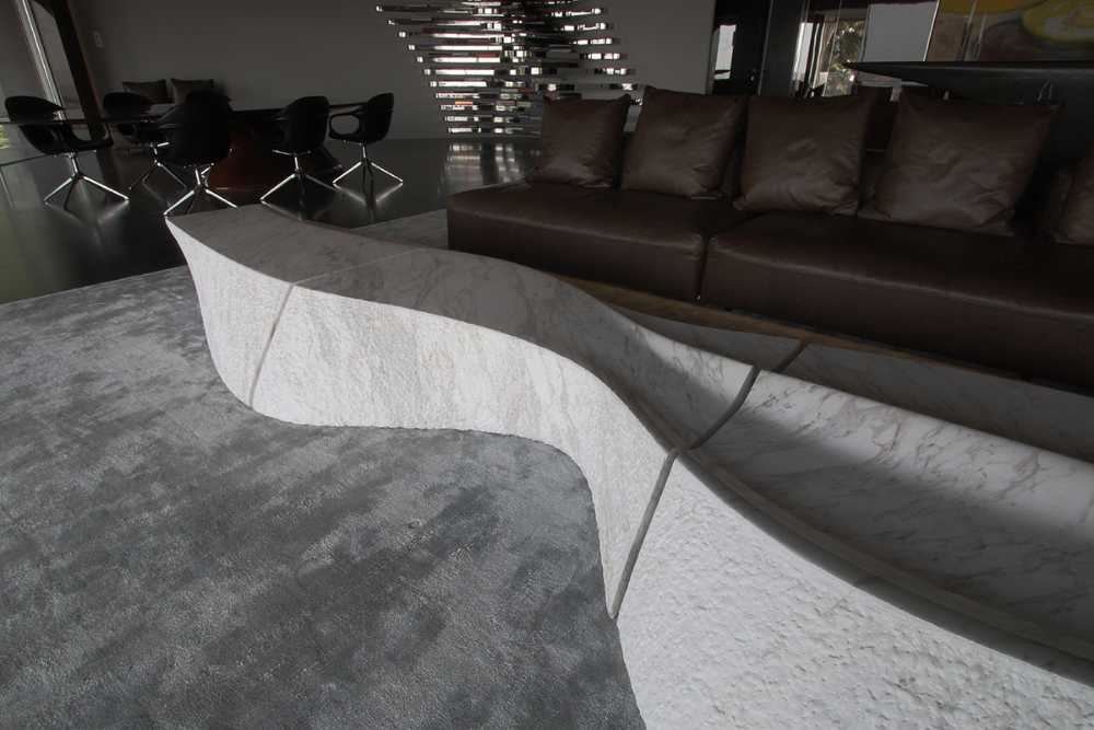
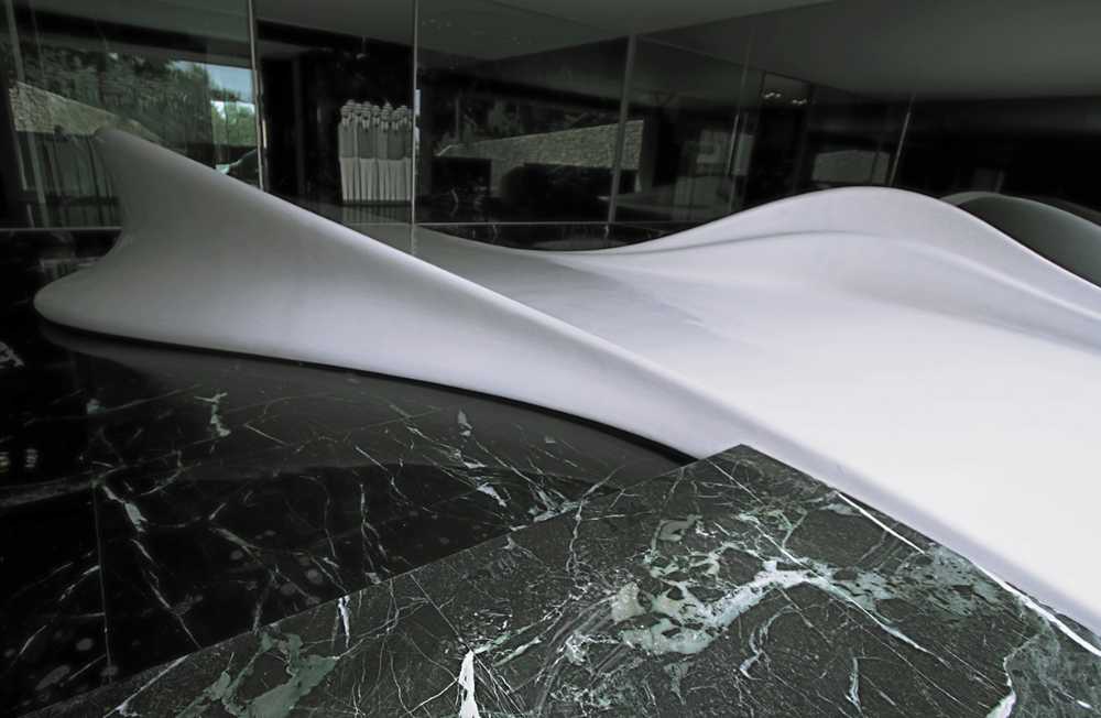
The choice of Travertine marble matches the typical colours of the beige stones that constitute the main element. The skin colour of the interior building has been carefully selected to match the colour of the ground. The glass balustrades were chosen to be more reflective and therefore replicate the image of the sky and the trees surrounding them. In general, the material palette of the entire building was designed to refer to the aesthetic concept of the indigenous Attica landscape, made of earth, stone and sky.
