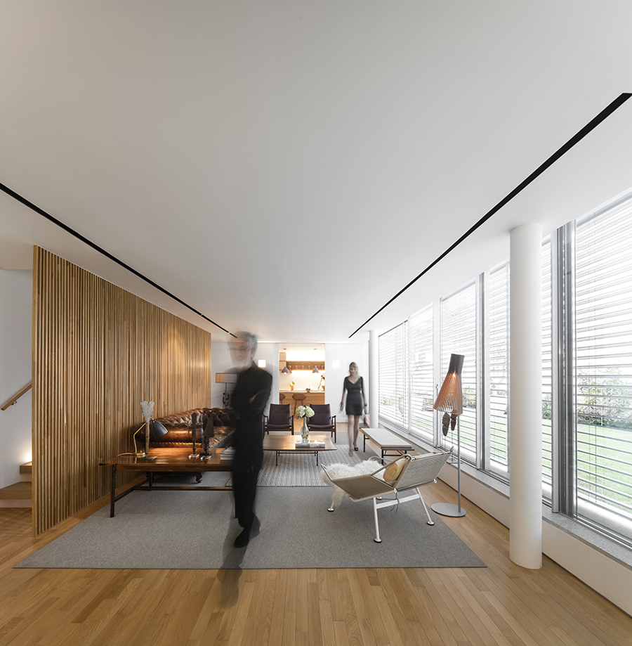
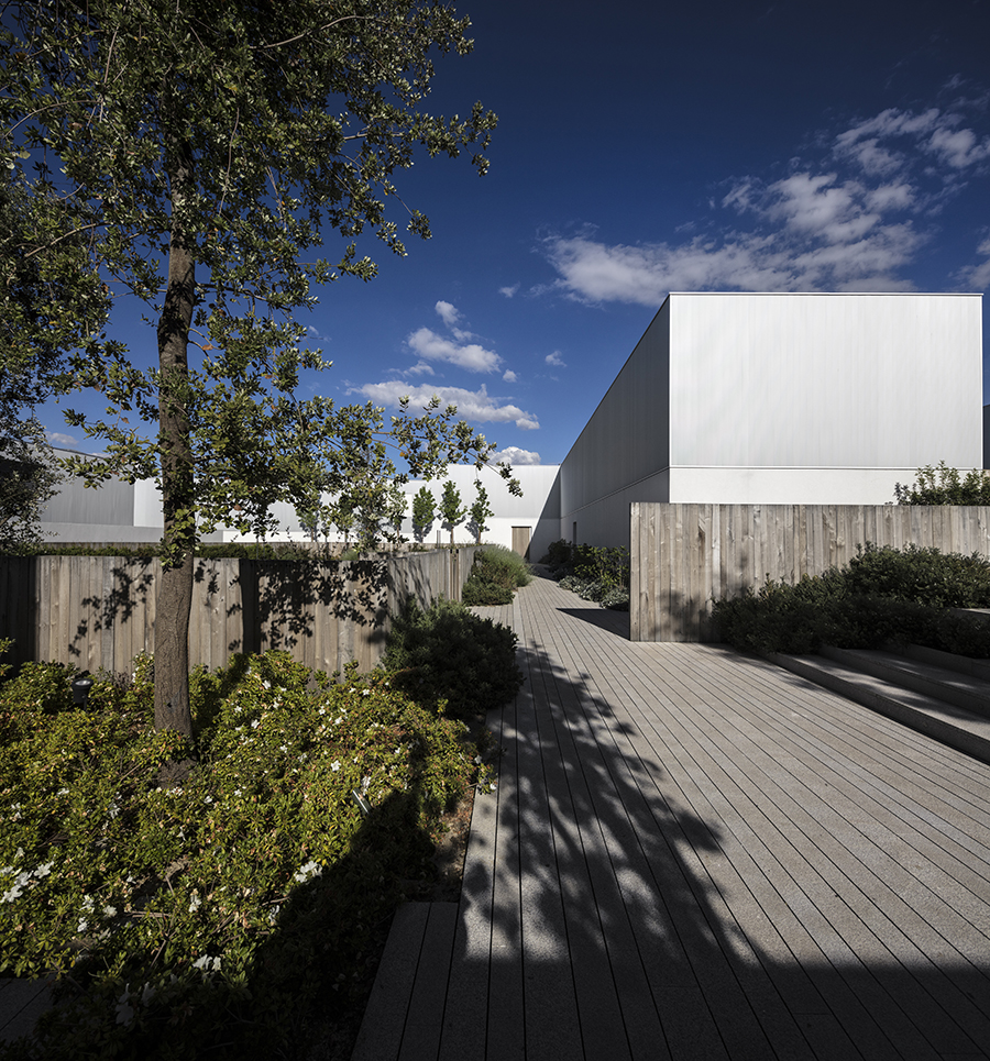
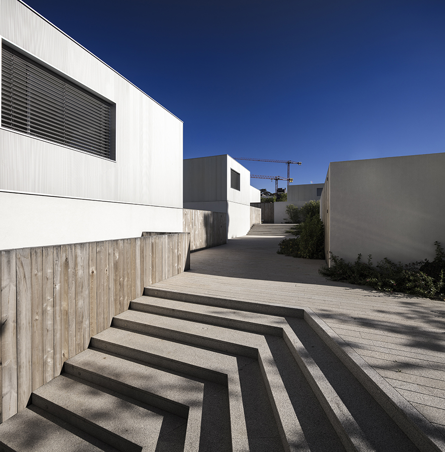
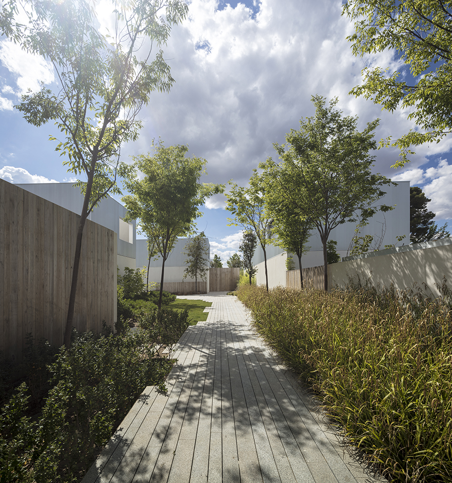
There remains a deliberate hint of the Spanish pueblo in the project, like the white walls and cubes. The houses are elongated, attenuated so that their walls begin to define emerging streets rather than the detached landscape of individual cubes. A series of interventions, repeating urban and landscape motifs and apparatuses, seems to stop the spaces between the houses becoming alleys and breaking down regularity. Steps, terraces and vegetation create a variety of suburban spaces and a coherent internal language that could theoretically be expanded and replicated, which is exactly what the architects intended, creating the development as a sort of prototype for a roll-out program.

An urban village like a pueblo in Madrid. Urban and private space merge
The MK27 Studio planned a new development on the outskirts of Madrid. The aim was to create a type of habitat where houses would be freely arranged around a network of public spaces to create a new type of public life.
- #L'Europe
- #Espagne
- #Revêtements de sol extérieurs
- #Complexe résidentiel
- #Nouvelle construction
- #Bois
- #Verre
- #Architectures
- #Architecture
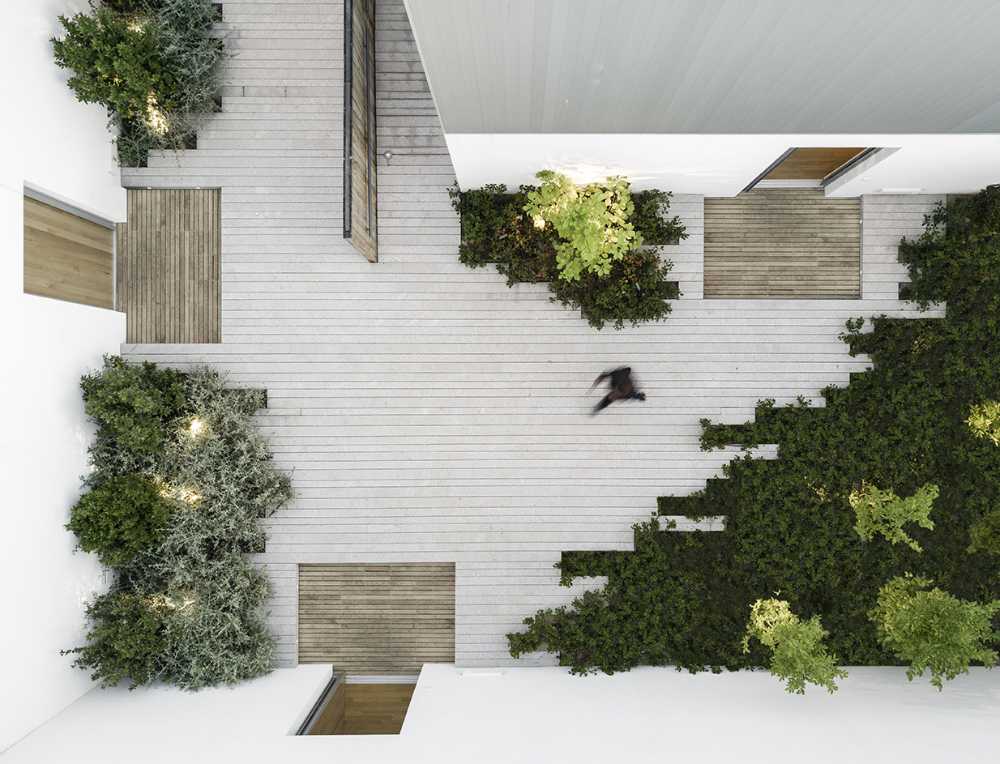
Equally important is the separation of traffic from pedestrians. This might seem like a two-storey house development, but in reality it is based on a three-storey cross-section with an entire underground parking level. Each house has access to its own individually connected parking space. The individual houses appear modest in size, with a width of only 5.5 m. Yet inside they reveal a surprising complexity of interdependent spaces and configurations of a solid and empty wall and openings
The ground floors are transparent, adapting to the public functions of life and the fully glazed walls open into courtyards that reflect the interior spaces so that the large area appears seamlessly. In the smaller houses, an elongated room houses the functions of the kitchen, dining room and living room with the possibility of dividing it or letting it converge into each other to give an impression of infinite space.
In the larger versions, the public space extends upwards through a void that expands the window surface appearing here as a double-height opening and will eventually allow the canopy of trees to interfere with the interior just as the floor seems to steal space from the outside. A gallery above occupies the cubic volume introducing a more intimate staircase to the spaces below and above and a contrast with the verticality of the window plane.
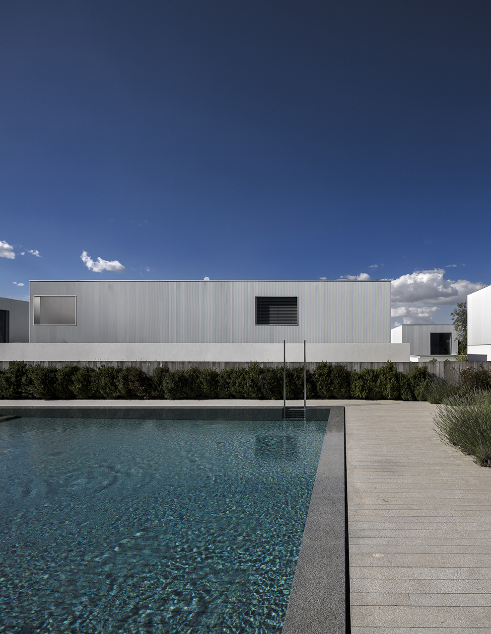
And at the centre of it all is water. The space in which one might expect to find an urban centre, the square defined by the church and town hall, market or topography is instead given over to the community pleasures of the pool. It puts a certain community activity at the centre of the scheme, the feeling that each house thrives on something bigger than itself rather than trying to create its own fenced-in and autonomous utopia. If one thing is unsettling here, it is the fences and walls which are still so clearly visible in the aerial photos. The streets and spaces here flow so fluidly that separating them from their surroundings seems hard and contrary to the purpose of the plan...
