The walls are covered with a soft touch of recycled oak to allow the texture of the custom furniture to stand out and to highlight the dark grey concrete of the bar. Warm, dark tones on the ceilings and upper plinths form a backdrop for the rows of light bulbs connecting the two areas


De Biertuin West in Amsterdam. Interior and exterior design inspired by the German biergärten
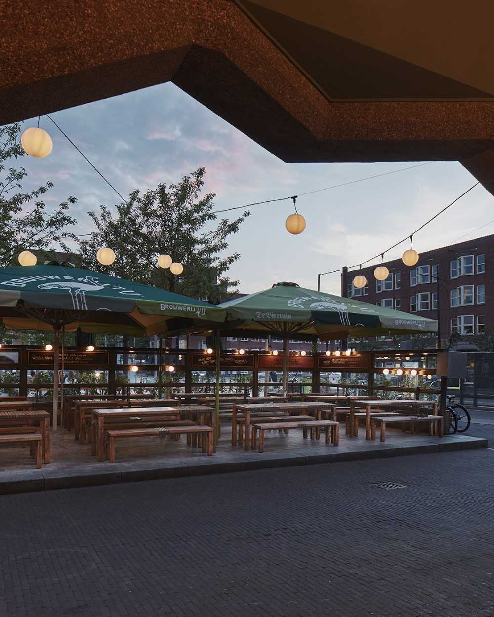
The concept is inspired by the German biergärten, an open-air area surrounded by trees, where beer and food are served on long wooden tables, highlighting in this way the original architecture of the building.
Linearity, compactness and warmth are the main components of the design. These abstract elements are translated into an interplay of raw materials often found in outdoor spaces such as concrete, wood and copper
- #Pays-Bas
- #L'Europe
- #Restauration
- #Pub / Brasserie
- #Bois
- #Restylage
- #Design d’intérieur
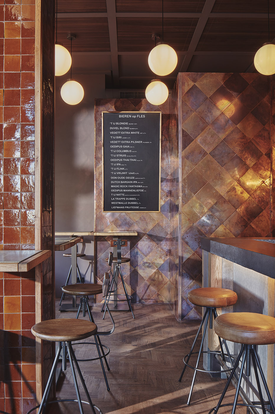
The irregularity of the red bricks is contrasted by the geometry of the aligned light bulbs and the rhythm of the square wooden elements that bounce from the ceiling to the tables. A large column stands in the centre of the left-hand side of the bar, covered with red tiles whose glossy texture is intensified by the reflection of the light balls hanging from the ceiling
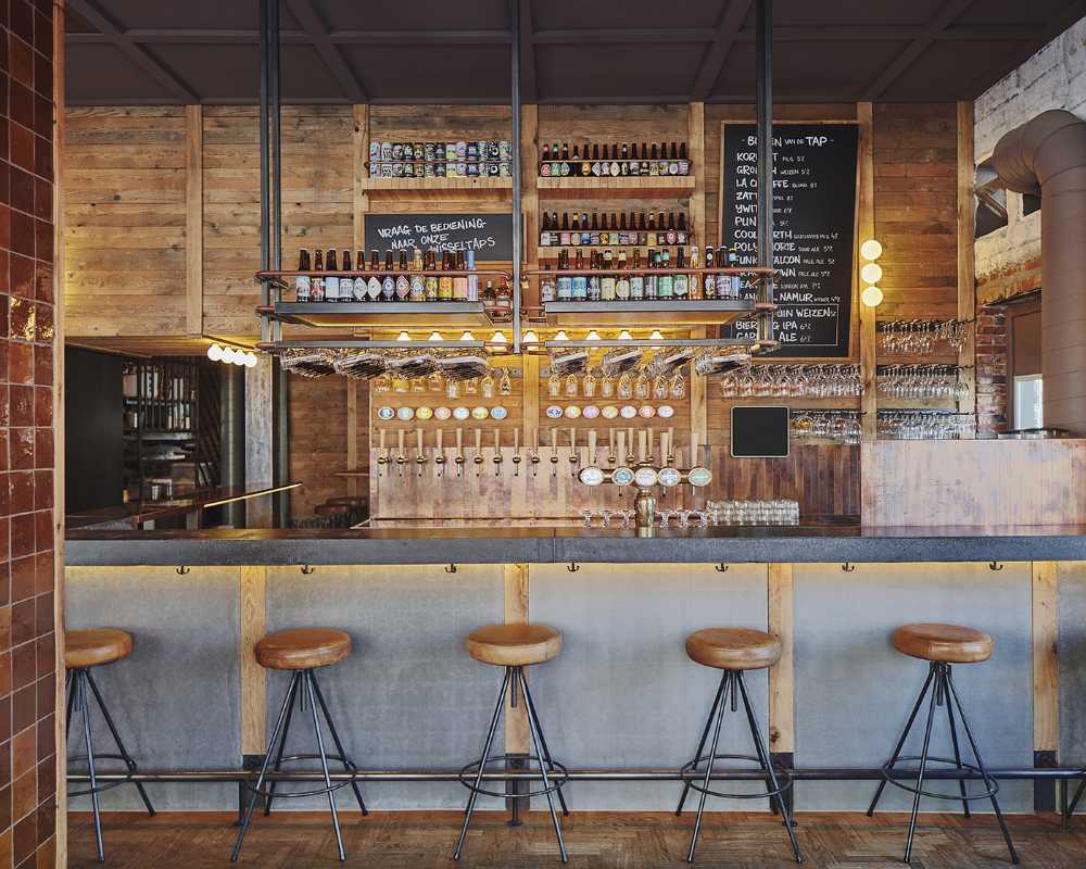
The existing black and white terrace is transformed into a playground for the design studio as it plays with shapes and colours in combination with a herringbone wooden floor that runs through the largest area of the bar. Long lines of high tables combine with solid wood benches and stools to delineate the beating heart of De Biertuin: the bar
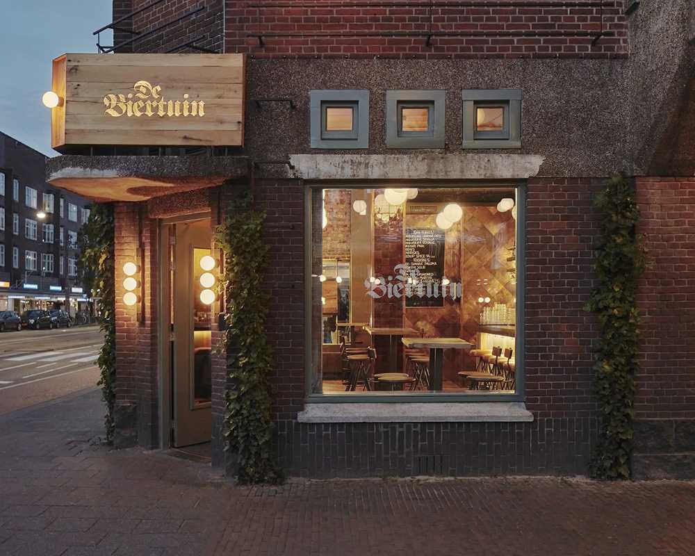
Outside, the terrace is defined by a composition of twelve large custom-made wooden benches and tables, some of which are finished with a layer of dark grey concrete on top. A grid of warm bulbs decorates the terrace on the front façade of the main building.
Gallery
Photo credits
Top image, content and gallery images: Maarten Willemstein


