Behind a historic street, Culumus Studio designs the layout of a psychologist's office following the ways in which he works. Skylights and windows create a softly lit space with no dark corners. Wood paneling, muted greens and an abundance of plants evoke a natural sense of well-being. Such a bright and relaxing space is a novelty in a pre-existing building, but somehow, it feels like it has always belonged there

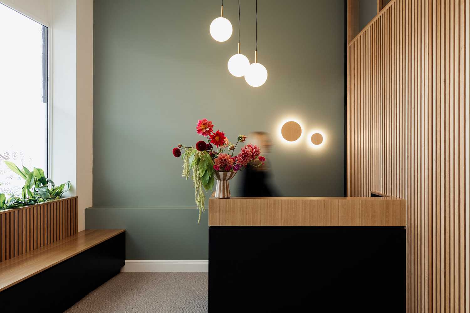
A quiet psychology practice in Tasmania. Peaceful light and a sense of welcome underpin the therapy as much as the space that houses it
Refined, yet informal. Honest. Open to all. In this busy Hobart suburb, the quiet psychology studio, inside a historic building, is an oasis of calm
- #Océanie
- #Australie
- #Architecture
- #Mobilier
- #Offices
- #Restylage
- #Design
- #Architecture

Culumus' design made the space "quiet, but not silent." Soft materials such as long curtains and carpets muffle conversations without erasing the comfort of background noise. With a muted color palette and soft curved edges, the realized studio is a space where clients feel welcomed and where psychologists enjoy working
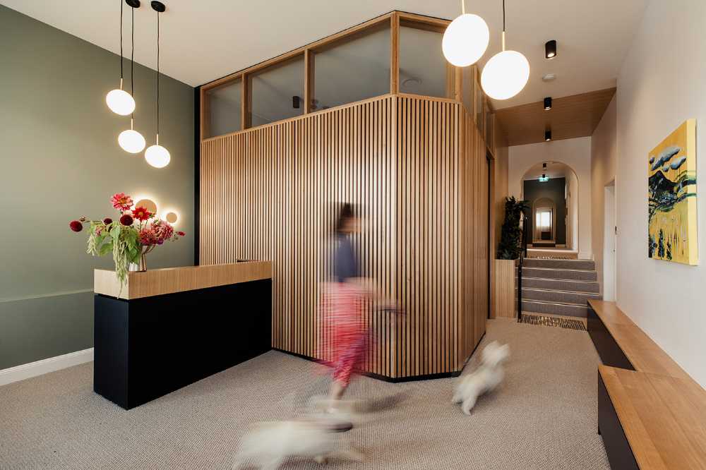
Tasmanian oak wood, which has a particular way of wearing out, brings natural warmth and informality. We find it in several applications within the practice: wood slats at the reception create a texture of light and shadow; it also wraps around threshold spaces, transitioning to solid paneling in the counseling rooms and minimal treatment in the back of the building
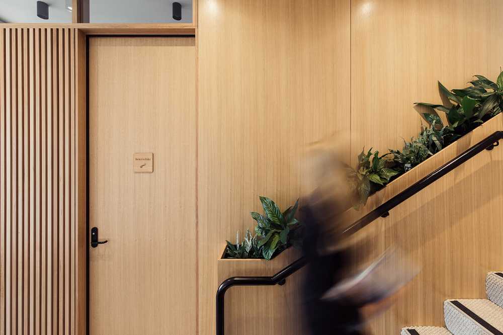
Plants that enhance the feeling of well-being were also useful in making some functional elements aesthetically pleasing. One example is the planter that serves as a handrail, becoming a pleasant, relaxing and welcoming detail, in keeping with the whole style of the studio
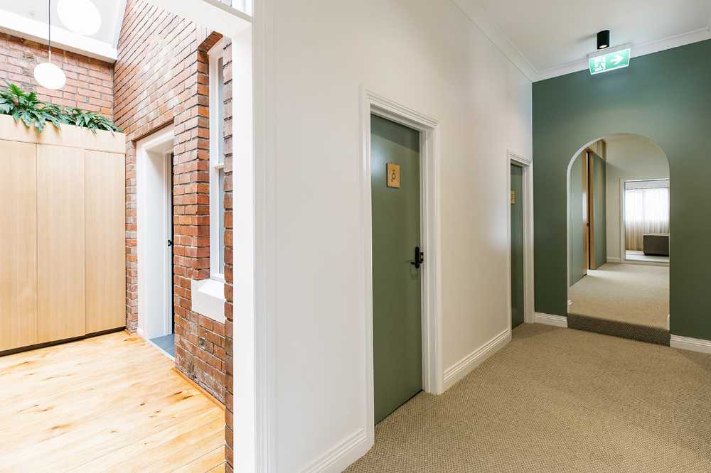
Gallery
Photo credits
Top image, content and gallery images: Jesse Hunniford


